Edible Cell Models |
|||
 |
 |
||
 |
 |
||
 |
 |
||
|
|
|||
| Cell Page | Notes page | ||
Edible Cell Models |
|||
|
|
||
|
|
||
|
|
||
|
|
|||
| Cell Page | Notes page | ||
Dichotomous Key
The identification of biological organisms can be greatly simplified using tools such as dichotomous keys. A dichotomous key is an organized set of couplets of mutually exclusive characteristics of biological organisms. You simply compare the characteristics of an unknown organism against an appropriate dichotomous key. These keys will begin with general characteristics and lead to couplets indicating progressively specific characteristics. If the organism falls into one category, you go to the next indicated couplet. By following the key and making the correct choices, you should be able to identify your specimen to the indicated taxonomic level.
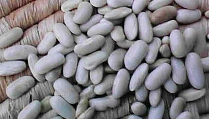
Sample key to some common beans used in the kitchen:
 |
 |
 |
 |
 |
| 1a. | Bean round | Garbanzo bean |
| 1b. | Bean elliptical or oblong | Go to 2 |
| 2a. | Bean white | White northern |
| 2b. | Bean has dark pigments | Go to 3 |
| 3a. | Bean evenly pigmented | Go to 4 |
| 3b. | Bean pigmentation mottled | Pinto bean |
| 4a. | Bean black | Black bean |
| 4b. | Bean reddish-brown | Kidney bean |
Click here for correct answers
| Developing a Controlled Experiment |  |
Directions: Using your knowledge of the Scientific Method, complete the following situations.
1. Define hypothesis?
2. Define experimental variable?
3. Why is it important for an experiment to contain a control?
4. Develop a controlled experiment to back up the following hypothesis:
The temperature of a lake has an effect on a fish’s ability to produce viable offspring.
| BACK |
Description: The purpose of this experiment is to determine the types of pigments found in various vegetation. The students will gather plants, soak them in acetone and use coffee filter strips to separate the pigments. Then the students will determine the pigments found in each type of leaf. The pigments found in spinach leaves, lettuce leaves and marigold leaves are all different. Paper Chromatography is a technique that enables us to separate plant pigments. The pigments found in plants vary and the process of chromatography is important in the detection of the types of pigments found in each.
Needed Materials: Acetone fingernail polish remover, test tubes or other empty containers (enough for 5 containers per group), felt tip markers, coffee filters, pigment guide, masking tape, scissors, spinach leaves, mum leaves, iceberg lettuce and leaves of various plants found in your schoolyard.
Safety Rule: Avoid inhaling the vapors from the acetone and spilling it on your clothing.
Student Information: The following information will provide you with the steps for conducting your plant chromatography experiment. It is important to hold all of the variables constant except for those that are being manipulated. Constant (or controlled variables) would be such things as: the length of the filter paper strip, the amount of time the paper is left in the solution, the amount of acetone in the container, the size of the container being used, etc. Manipulated (or independent) variables would be those things that we change to see if the response will be different, such as: type of plant being studied. The responding (or dependent) variable for this experiment will be the different pigments found in each of the different types of vegetation.
The reporting form for this experiment is set up so that you can determine how many different kinds of vegetation you would like to use, the kind of container you would like to use and how long your strips of filter paper will be. Also remember that a good scientific experiment is repeated a minimum of three times. Therefore, your data will be more accurate if you conduct several experiments that are exactly the same and then compile an average of your data before submitting it.
Discussion Questions
Line graphs
Pie charts
Bar graphs
Mean
Median
Mode
A line graph is a way to summarize how two pieces of information are related and how they vary depending on one another. The numbers along a side of the line graph are called the scale.
Example 1:

The graph above shows how John’s weight varied from the beginning of 1991 to the beginning of 1995. The weight scale runs vertically, while the time scale is on the horizontal axis. Following the gridlines up from the beginning of the years, we see that John’s weight was 68 kg in 1991, 70 kg in 1992, 74 kg in 1993, 74 kg in 1994, and 73 kg in 1995. Examining the graph also tells us that John’s weight increased during 1991 and 1995, stayed the same during 1991, and fell during 1994.
Example 2:
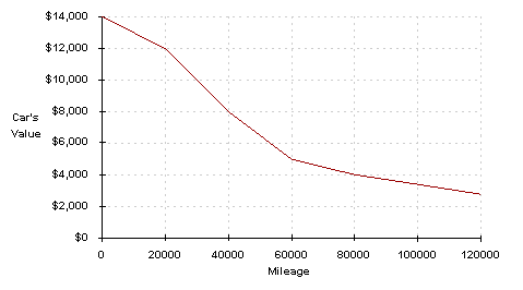
This line graph shows the average value of a pickup truck versus the mileage on the truck. When the truck is new, it costs $14000. The more the truck is driven, the more its value falls according to the curve above. Its value falls $2000 the first 20000 miles it is driven. When the mileage is 80000, the truck’s value is about $4000.
A pie chart is a circle graph divided into pieces, each displaying the size of some related piece of information. Pie charts are used to display the sizes of parts that make up some whole.

Example 1:
The pie chart below shows the ingredients used to make a sausage and mushroom pizza. The fraction of each ingredient by weight is shown in the pie chart below. We see that half of the pizza’s weight comes from the crust. The mushrooms make up the smallest amount of the pizza by weight, since the slice corresponding to the mushrooms is smallest. Note that the sum of the decimal sizes of each slice is equal to 1 (the “whole” pizza”).

Example 2:
The pie chart below shows the ingredients used to make a sausage and mushroom pizza weighing 1.6 kg. This is the same chart as above, except that the labels no longer tell the fraction of the pizza made up by that ingredient, but the actual weight in kg of the ingredient used. The sum of the numbers shown now equals 1.6 kg, the weight of the pizza. The size of each slice is still the same, and shows us the fraction of the pizza made up from that ingredient. To get the fraction of the pizza made up by any ingredient, divide the weight of the ingredient by the weight of the pizza. What fraction of the pizza does the sausage make up? We divide 0.12 kg by 1.6 kg, to get 0.075. This is the same value as in the pie chart in the previous example.

Example 3:
The pie chart below shows the ingredients used to make a sausage and mushroom pizza. The fraction of each ingredient by weight shown in the pie chart below is now given as a percent. Again, we see that half of the pizza’s weight, 50%, comes from the crust. Note that the sum of the percent sizes of each slice is equal to 100%. Graphically, the same information is given, but the data labels are different. Always be aware of how any chart or graph is labeled.

Example 4:
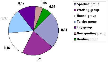
The pie chart below shows the fractions of dogs in a dog competition in seven different groups of dog breeds. We can see from the chart that 4 times as many dogs competed in the sporting group as in the herding group. We can also see that the two most popular groups of dogs accounted for almost half of the dogs in the competition. Suppose 1000 dogs entered the competition in all. We could figure the number of dogs in any group by multiplying the fraction of dogs in any group by 1000. In the toy group, for example, there were 0.12 × 1000 = 120 dogs in the competition.
Bar graphs consist of an axis and a series of labeled horizontal or vertical bars that show different values for each bar. The numbers along a side of the bar graph are called the scale.
Example 1:
The bar chart below shows the weight in kilograms of some fruit sold one day by a local market. We can see that 52 kg of apples were sold, 40 kg of oranges were sold, and 8 kg of star fruit were sold.

Example 2:
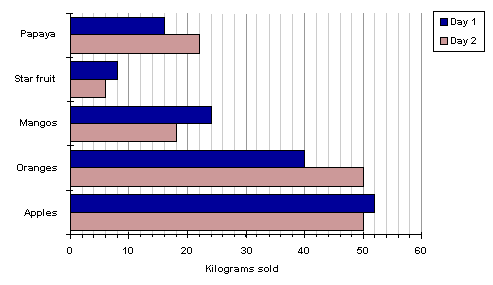
A double bar graph is similar to a regular bar graph, but gives 2 pieces of information for each item on the vertical axis, rather than just 1. The bar chart below shows the weight in kilograms of some fruit sold on two different days by a local market. This lets us compare the sales of each fruit over a 2 day period, not just the sales of one fruit compared to another. We can see that the sales of star fruit and apples stayed most nearly the same. The sales of oranges increased from day 1 to day 2 by 10 kilograms. The same amount of apples and oranges was sold on the second day.
The mean of a list of numbers is also called the average. It is found by adding all the numbers in the list and dividing by the number of numbers in the list.
Example:
Find the mean of 3, 6, 11, and 8.
We add all the numbers, and divide by the number of numbers in the list, which is 4.
(3 + 6 + 11 + 8) ÷ 4 = 7
So the mean of these four numbers is 7.
Example:
Find the mean of 11, 11, 4, 10, 11, 7, and 8 to the nearest hundredth.
(11 + 11 + 4 + 10 + 11 + 7 + 8) ÷ 7 = 8.857…
which to the nearest hundredth rounds to 8.86.
The median of a list of numbers is found by ordering them from least to greatest. If the list has an odd number of numbers, the middle number in this ordering is the median. If there is an even number of numbers, the median is the sum of the two middle numbers, divided by 2. Note that there are always as many numbers greater than or equal to the median in the list as there are less than or equal to the median in the list.
Example:
The students in Bjorn’s class have the following ages: 4, 29, 4, 3, 4, 11, 16, 14, 17, 3. Find the median of their ages. Placed in order, the ages are 3, 3, 4, 4, 4, 11, 14, 16, 17, 29. The number of ages is 10, so the middle numbers are 4 and 11, which are the 5th and 6th entries on the ordered list. The median is the average of these two numbers:
(4 + 11)/2 = 15/2 = 7.5
Example:
The tallest 7 trees in a park have heights in meters of 41, 60, 47, 42, 44, 42, and 47. Find the median of their heights. Placed in order, the heights are 41, 42, 42, 44, 47, 47, 60. The number of heights is 7, so the middle number is the 4th number. We see that the median is 44.
The mode in a list of numbers is the number that occurs most often, if there is one.
Example:
The students in Bjorn’s class have the following ages: 5, 9, 1, 3, 4, 6, 6, 6, 7, 3. Find the mode of their ages. The most common number to appear on the list is 6, which appears three times. No other number appears that many times. The mode of their ages is 6.
![]()
Visit the Math League
![]()
© 1997-2001 by Math League Multimedia
This page may not be mirrored or reproduced on any other internet site.
Last updated March 2001 by Mark Motyka.
